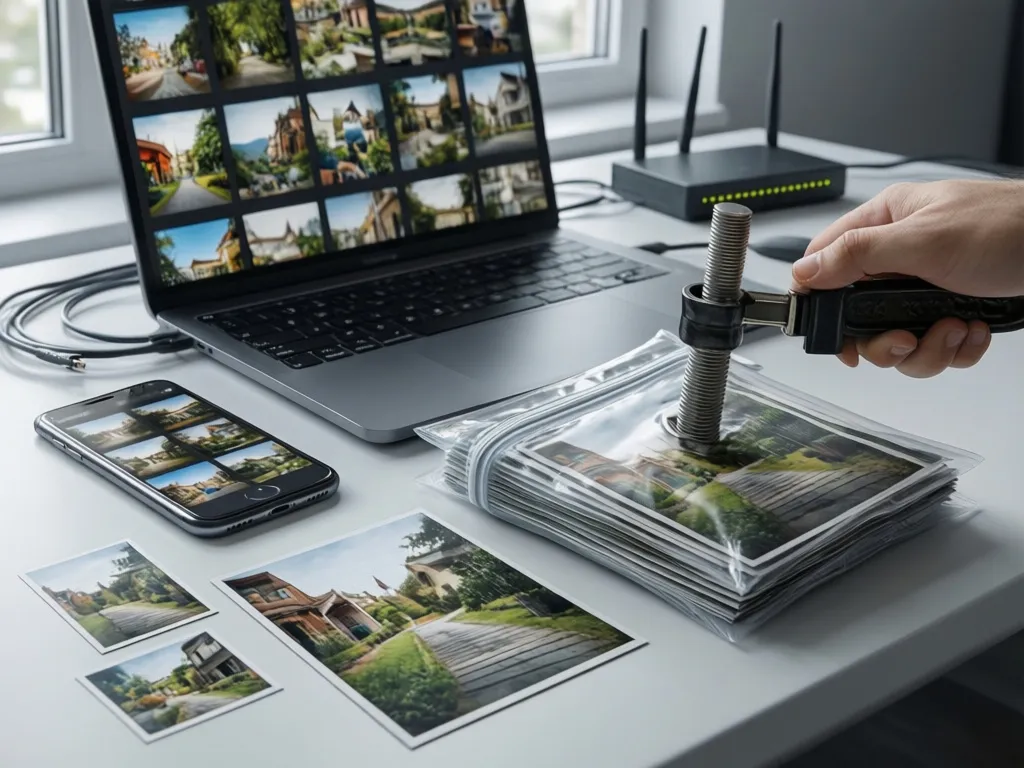
Why modern image optimization matters
Images are often the largest resource on a page. Serving appropriately sized files in an efficient format reduces load time, data transfer and energy use while improving user experience. A clear strategy covers three areas: pick the right format for the job, deliver images sized to the user device, and compress with settings that preserve perceptual quality.
Core principles to guide choices
Start with three rules that prevent common mistakes. First, always resize to the display size before compression. Second, prefer modern formats when supported and provide fallbacks. Third, measure perceptual quality rather than only file size. These rules keep trade offs predictable and repeatable.
Resize before compress
Resizing reduces pixels to exactly the dimensions a browser will render. Compressing a large image and then letting the browser downscale wastes bandwidth and degrades perceived sharpness. Server side resizing or build time processing is the most reliable approach.
Use format negotiation with fallbacks
Modern formats like AVIF and WebP offer much better compression than legacy JPEG or PNG for many images. Rely on content negotiation or markup that prefers modern formats and falls back to universally supported formats. Avoid shipping a single format to all clients.
Optimize perceptual quality
Compression settings should be chosen by viewing images at intended sizes. Visual artifacts vary by image content. Text heavy or line art images often need lossless or PNG like handling while photographs compress well with lossy formats and moderate quality settings.
Modern formats and how to choose between them
There is no single best format for every case. Consider these characteristics when choosing a format for a given asset.
- AVIF generally yields the best compression for photographic content at a given quality level, especially for scenes with fine detail and gradients.
- WebP is widely supported and offers good compression for photographs and many UI images. It is a practical first step for compatibility and gain.
- JPEG and PNG remain useful as fallback formats. Use JPEG for photographs when modern formats are not available and PNG or SVG for lossless line art and icons.
Because browser support and decoder performance change over time, adopt a pattern that serves AVIF to clients that accept it, WebP as a secondary option, and legacy formats as fallback. Implement feature detection or accept header based negotiation rather than hard coding based on user agent strings.
Responsive images: sizing and markup patterns that work
Responsive images avoid sending larger files than necessary. Two common patterns are density descriptors and width descriptors. Choose the approach that matches your layout and source assets.
Width descriptor workflow
Produce a small set of resized images that match typical breakpoints and device widths. Provide those variants in the markup with width descriptors so the browser can pick the best match. For example, a typical srcset value lists file names paired with numeric widths like quote marks around a list of file names followed by numeric width descriptors such as photo400.jpg 400w comma photo800.jpg 800w. Then set sizes to reflect the layout, for example quote marks around a media condition and a size value such as (max-width: 600px) 100vw comma 600px. That lets the browser compute which file is appropriate for the current viewport.
Density descriptor workflow
Use density descriptors when a physical pixel density choice is more relevant than layout width. Provide a base image plus variants for 2x and 3x displays using descriptors like 1x and 2x. This is common for icons and small UI graphics.
Art direction with separate crops
When the crop or composition must change between layouts, provide distinct images and let the browser choose with markup that distinguishes them. Delivering different crops prevents awkward center crops or subject loss on narrow viewports.
A practical compression strategy you can apply
Below is a step by step workflow that balances automation with visual checks. Implement these steps during build or at upload time.
- Inventory Identify image types on the site grouping them as photographs, illustrations, icons or text heavy images.
- Create resized variants For photographs generate a set of logical widths that match your layout grid and common device sizes. For icons produce vector or appropriately sized bitmap versions for each density.
- Encode in multiple formats Produce AVIF and WebP variants plus a reliable fallback such as optimized JPEG or PNG. Keep a lossless master if you may need alternate crops later.
- Choose quality presets by image class For photographs pick a quality range and test visually. Many teams use a perceptual quality target rather than fixed quality numbers. For UI images prefer lossless or visually perfect settings.
- Automate with fast tooling Use a production oriented library such as libvips or a toolchain like sharp for Node. These are faster and use less memory than some alternatives when processing large batches.
- Validate visually and with metrics Compare file sizes and view images at target sizes. Tools that compute structural similarity or perceptual metrics can help flag regressions but do not replace human checks.
Tooling and settings that balance speed and quality
Prefer tools designed for pipeline use. libvips and sharp are examples of libraries that scale well and integrate into build systems. When choosing encoder settings remember the following trade offs.
- Lower quality values reduce size but may introduce blocking, ringing or banding. Tune per image class.
- Chroma subsampling reduces color information to save bytes. It improves compression for photos but can harm text and line art.
- Lossless modes preserve all detail but produce larger files. Use lossless only when necessary.
For AVIF and WebP, test both lossy and near lossless presets for critical assets. Different encoders implement quality scales differently so quality numbers are not directly comparable across encoders. Always test final output in the browser at the sizes users will see.
Testing, measurement and acceptable quality
Set objective checks that prevent regressions and keep visual quality consistent. Include automated comparisons in your pipeline and spot check the most visible pages manually.
Automated checks can compute file size budgets by page or by asset type and fail the build when budgets are exceeded. Visual regression tools that capture rendered pages provide a higher level safety net to catch layout or rendering regressions caused by changed images.
Deployment patterns and CDN features
CDNs often offer on the fly format conversion, responsive resizing and caching. Using a CDN feature can simplify the pipeline because the origin can store a high quality master while the CDN serves optimized variants based on request headers. If you rely on CDN conversion, ensure you control caching keys and vary based on format and width so the CDN stores correct variants. Also verify cache control headers so variants do not become stale.
Accessibility and layout stability
Always include appropriate alt text. Provide explicit width and height attributes on img elements or set an aspect ratio to avoid layout shift. When responsive sizing is used, the browser can reserve the correct layout space if it knows the intrinsic aspect ratio. That reduces cumulative layout shift and improves perceived performance.
Operational checklist to get started
- Classify images by type and priority so effort targets the pages that matter most.
- Build a small set of canonical sizes for common breakpoints and generate variants automatically.
- Encode AVIF and WebP plus a fallback and serve them using negotiation or markup that prefers modern formats.
- Automate visual checks and file size budgets in your CI pipeline.
- Use CDN features for on demand conversion only if you handle caching keys and invalidation correctly.
Optimizing images is an iterative process. Start with high traffic pages and the largest images, measure the user facing improvements, then expand the workflow site wide. Over time, a consistent pipeline that produces sized variants in modern formats and validates visual quality will reduce bandwidth, speed up pages and improve experience for users on all devices.